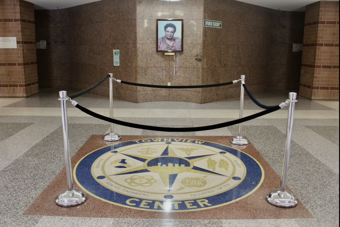
As you step onto the Townview campus, you’re immediately greeted by a grand set of stairs, bathed in natural light from the pyramid rooflight above. Walking around the stairs and toward the center of the second floor, you’ll find the Townview crest embedded into the floor. It’s an iconic part of the campus that every student becomes familiar with. For many, avoiding the infamous Townview crest has become a nearly sacred tradition. Rumor has it that stepping on the crest will doom you to never graduate. Though stepping around the crest began as a legend, it has evolved into a cherished tradition tied to respect for the school’s history.
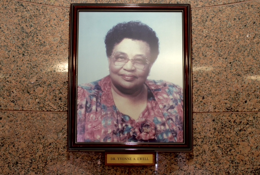
The Townview crest honors the legacy of Yvonne E. Ewell, a former Dallas ISD Advocate for Educational Equity and Integration. In 1964, she became the first African American to be appointed district-wide elementary school consultant. Her career reached a milestone in 1978 when she was named associate superintendent, making her the highest-ranking African American administrator in the state of Texas. Ewell played a vital role in the creation of the Townview campus and the magnet programs within the district. In honor of her lasting impact, the school was named after her, and the crest was designed as a tribute to her dedication to educational integration and excellence.
The design of the crest itself is a powerful representation of the unity that defines Townview. It embodies the collaborative spirit of the six distinct schools that make up the Townview Magnet Center. At the same time, it symbolizes the literal and figurative center of the campus. The design incorporates 6 symbols: scales for the Law Magnet, a caduceus for the School of Health Professions, businessmen for the School of Business, an atom for the School of Science and Engineering, a globe with a lightning bolt behind it for the School for the Talented and Gifted, and three hands joined together for the School of Educational and Social Services. At the very center, a star sits behind a view of downtown Dallas, symbolizing Townview’s position as the heart of the city. The campus is a place where students from all walks of life come together to pursue excellence, and where the view of the city from certain classrooms offers a constant reminder of the opportunities that await. It’s a visual representation of Townview’s position as a “star” in Dallas.
The design of the crest is a powerful representation of collaboration and excellence. The signature blue and gold colors of Townview are emphasized throughout. The blue symbolizes integrity, wisdom, and dignity—values that the school strives to instill in its students—while the gold represents triumph, optimism, and compassion. Together, the blue and gold create a striking contrast that not only adds visual depth to the design but also serves as a reminder of the balance between intellect and character, strength and empathy, that Townview students are expected to carry with them.
The tradition of avoiding the crest isn’t just about superstition—it’s about respecting the history and values that the crest represents. By stepping around it, students honor the hard work that went into creating Townview Magnet Center and the principles that the school stands for. The crest is not just an emblem; it is a living symbol of the shared ideals, hard work, and collective spirit that makes Townview so unique.



Amy Sanchez Ramirez • Dec 5, 2024 at 10:49 am
This was such an enjoyable read! I had never given much thought to the crest or delved into the rich history of Townview before, but this provided such a meaningful perspective on our school’s legacy.
Amy Sanchez Ramirez • Dec 5, 2024 at 10:42 am
This was such an enjoyable read! I had never given much thought to the crest or delved into the rich history of Townview before, but this provided such a meaningful perspective on our school’s legacy.